Tips for Using White Paint Effectively in Your Bay Area Home
It used to be that white interior paint was considered just the starting point. It was the neutral that paved the way for deeper and bolder colors. White rarely ever stood alone, and if it did it carried the stigma of being a sort of antiseptic, clinical option that left you wanting more.
Well, not any longer.
White is finding a celebrated place in homes today, and for good reason. Rather than seeing it as an absence of color, it actually celebrates color by allowing for a nearly unlimited combination of furniture, decor, artwork, and accent pieces that can be easily interchanged according to your taste.
Paint manufacturers are also stepping up to the plate (and the demand) by developing stunning variations of white, populating a huge extended family of warmer and cooler options that you can pick from. To get a little sense of what’s available, click over to Houzz.com and take a look at these white interiors.
This all begs the question: with so many options to choose from, how do you successfully incorporate white into your home’s palette?
Choosing and Using the Perfect White Interior Paint

- Consider Sunlight - Should you use a warmer or cooler white? Well, this can be largely determined by the amount of direct sunlight your room receives. For spaces that feel our intense California sun, try a cooler white with grey undertones. For darker rooms, an off-white that will warm the space is a good choice.
- Can’t Tell the Difference Between the Swatches? - Sometime swatches are just too small… Try painting a few samples on larger squares of poster board and taping them to your wall. That way you can get a better sense of how the different whites interact with your lighting throughout the day.
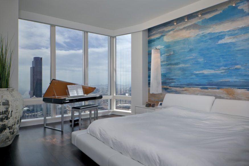
- Layer Your Whites - If you have white furniture or curtains as well, you can avoid an overly stark look by mixing whites that are warmer and cooler, creamier and crisper.
- Add Contrast - White and black may be opposites, but they work together beautifully to offer a timeless style.
- Modern or Classic? - For a more modern look, pick colder, crisp, and glossier whites. For a more aged and lived-in feel, try a softer vanilla.
To see what a room really looks like in a color that interests you, try searching for the specific color on Houzz.com. You often will find examples of rooms painted in that exact color. Major manufacturers like Sherwin-Williams also often provide photos online of the color you’ve selected being used within an actual living space.
Talk to a Local, Professional Painting Company
If you live in the Bay Area, we hope you’ll contact us at MB Jessee Painting. It would be our pleasure to help you navigate your options and make the best decision possible for your specific goals and home.